MSU Identity: Logo Use Guide
Using the MSU brand presents a unified image to our audiences. A coordinated approach ensures the MSU brand recognition in the market. Our communications are more effective and successful when we speak with a unified voice to elevate the university brand in the eyes of our audiences. Please use the MSU brand in all your communications to strengthen and amplify your message. If you have questions about logo use, please contact Amy Kanuch, Interim Chief Marketing Officer at amy.kanuch@montana.edu or 406-994-7462.
MSU Logo Use Guide

Core Logo
This version is used as the primary MSU logo and for the use of all MSU colleges, departments, research centers and work units. It is easily recognized at a variety of sizes for both print and digital communications.

Mountains & Minds Signature Logo
This version is used for outside audiences where the tag line adds additional information. It is also used when the communications would benefit from a more formal approach.

Initials Logo
This version is used in a few instances in which the final size is too small or too large, such as in small digital applications and large outdoor flag applications.
Brand Extensions

Brand extensions of the core mark are available for:
• all MSU academic colleges
• MSU Extension
• MSU Library
• Montana Agricultural Experiment Station
They are available in vertical and horizontal orientations and may receive all recommended core logo color treatments for best legibility.

Unit Identifiers

In nearly all cases, MSU offices, departments, schools, programs, institutes, services and centers should use the core logo or appropriate brand extension (above), without any further embellishment.
A unit identifier (UI) can be used in those rare cases when a unit/department/etc. has limited space. Use a UI that has been professional typeset by University Communications. Call or email to request yours.

Logo Use Guide - Color, size and spacing
Color, Size & Spacing

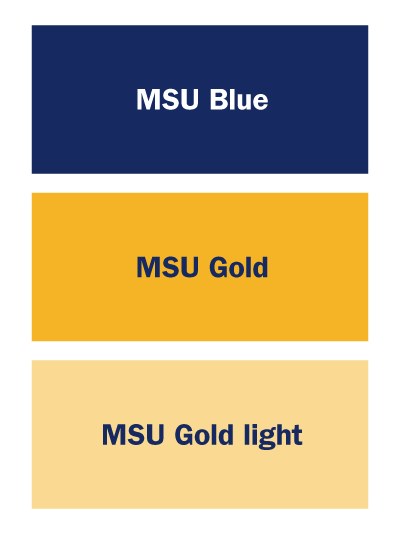
MSU’s primary colors are MSU Blue and Gold, we recommend using them as the dominant colors for most publication and promotional materials. Ideally, the logo should be MSU Blue (PMS* 281) and Gold (PMS* 124). When necessary, for the sake of legibility, it can also be reproduced in one-color as MSU Blue or black. Or reversed out to white and gold or solid white from dark backgrounds.
*Pantone Matching System

Print colors:
MSU Blue:
Hex: #0d2c6c
CMYK: 100, 85, 5, 36
MSU Gold:
Hex: #febe10
CMYK: 0, 27, 100, 0
MSU Gold light
Hex: #ffd990
CMYK: 0, 15, 50, 0
Web colors:
MSU Blue:
Hex: #162960
RGB: 22, 41, 96
MSU Gold:
Hex: #f4b425
RGB: 244, 180, 37
MSU Gold light
Hex: #fada92
RGB: 250, 218, 146

Clear space Leave adequate room around the logo. The “M” in “Montana” in the logo, is a good general guideline as seen to the left.
Minimum sizes To maintain full legibility and integrity, never reproduce the logo at sizes smaller than 0.875 inches or 63 pixels in width for the vertical logo and 1.25 inches or 90 pixels in width for the horizontal logo.

Respect It

Use the entire logo The MSU logo includes the logomark combined with the logotype. Through consistent use, we can create a distinctive visual identity that is easily recognized and that can be protected from impostors or unauthorized uses.
DO NOT change logo The logo should not be altered in any way.

Do not separate or remove parts of the logo.

Do not distort the logo.

Do not change the size of any portion of the logo without changing the size of the rest of the logo in proportion.

Do not add additional type or effects to the logo.

Do not create other logos using any portion of the logo. Do not create other logos for your office, program, etc. for that matter.

Do not change the color of any portion of the logo other than what has been specified on the previous page.
Use the logo this way
DO NOT use the logo this way


Do not use the black or blue logo on a dark background, even with outlines.


Do not use the logo on backgrounds that are too busy or do not provide adequate contrast.


Do use the logo as png with a transparent background if you intend on placing it over another graphic.
Do not use the logo as a jpg unless the background matches the background of the image exactly.
